The logo is the ambassador and flag bearer of the brand, which ensures that it does not fade from our memory. Her name, her idea is proud of the world, so it must radiate her essence. Therefore, a logo is not just a fancy design. He is a manipulator. And since the marketing world is a master of psychology, it's no wonder that companies hide secret messages in their logos. And this time we play Robert Langdon from The Da Vinci Code.
Although they are logos, which you will see below, almost a part of our cultural identity, but you will realize that they are not actually you know as far as you may have thought. It's like you think you know the street you walk down every day, but then you see something that makes you feel like a tourist.
READ MORE:
Some logos are buried messages deep (but still not as deep as the illuminati, so this task was much easier for Langdon), and for others, we don't need code breakers, we just have to look a little more closely. There are many messages inside them subliminal, which means they fly under the radar of our consciousness, but the subconscious mind detects it. They don't even want to be recognized, because then the logos would be revealed true purpose (manipulation). Well, some are just brilliant design solutions, which have nothing to do with what was written earlier.
Check how many hidden messages you know?
1. Amazon
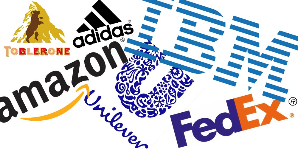
The first one association looking at the Amazon logo, chances are it's a yellow arrow a smile and that together with the letters it forms face. But there's more to it. Look where the arrow is pointing. To the letter "z", with which they want to say that they offer everything from a to z, well, according to our until ž.

2. McDonald's
"M" potato arcade stands for "M" like McDonald's and that's it. There is no logo multi-layered like their hamburgers. But if the designers didn't attach extra meaning to him, the customers did, at least if the psychologist is to be believed To Louis Cheskin, whose crazy theory is the reason McDonald's is still represented today. When the company is in the sixties wanted to replace the golden arcades, he convinced them otherwise, saying that the customers recognize in it on an unconscious level, according to Freud's analogy, breasts nursing mothers.
3. Google
Uncle Google is like uncles from the background. He doesn't play according to the rules. At least that's what he claims. It already hints at this with the logo, where four primary colors followed by the secondary, with which they wanted to show - in addition to blowing the whistle on the rules - also their own playful nature.
4. Toblerones
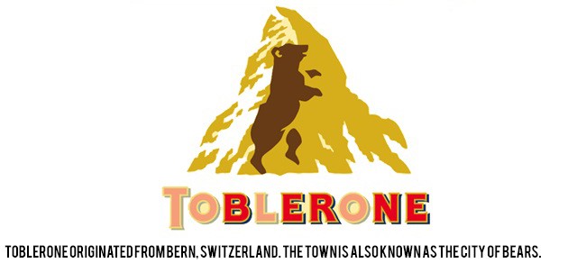
They are Toblerones Swiss chocolate with honey and almond cream. Who doesn't know that? But few know that you can tell their origin from the word and the logo. It is hidden in the word Bern (where it originates from), and the town is now, in addition to chocolates, known primarily for bears. Did you notice it "fossilized" in the mountain?
5. Pepsi
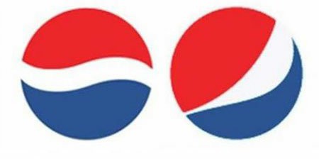
Earlier we mentioned the Da Vinci code and Illuminati. It appears to have the Pepsi logo, which is years old 2008 underwent a cosmetic correction worth one and a half million euros, all the details to assign the case to Langdon, and even he will have a hard time confirming all the wild theories circulating in the document entitled "Breathtaking Design Strategy" agencies Arnell Associates ("make-up artist" of the logo) and who say that the logo is a tangle feng shui, renaissance, dynamo theory, theory of relativity, universes, etc. Yes, and then the marmot howls…
6. Toyota
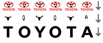
The logo of this Japanese car manufacturer is composed from three ellipses, which symbolize three hearts. The heart of the customer, the heart of the car and the heart of technological progress. The smaller ellipses also form Toyota's initials, the letter "T". But everyone already knows that, but what not everyone knows is that you can by isolating parts of the sign write the word Toyota.
7. Wow
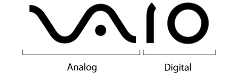
Vaio is more than just modern font, because if you look closely, you will see that the first two letters represent analog symbol, and the last two of the binary (symbols of digitality).
8. Mitsubishi
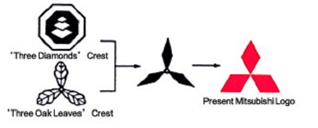
The logo of this Japanese car manufacturer goes back a long way in history and is rooted in two coats of arms of the Iwasaki family (founder). They were building the first one three diamonds, another three oak leaves. When they were fused together, today's three red diamonds were created. The name Mitsubishi is also a combination of a Japanese word Mitsu (= three) and Bisha (= diamonds).
9. IBM
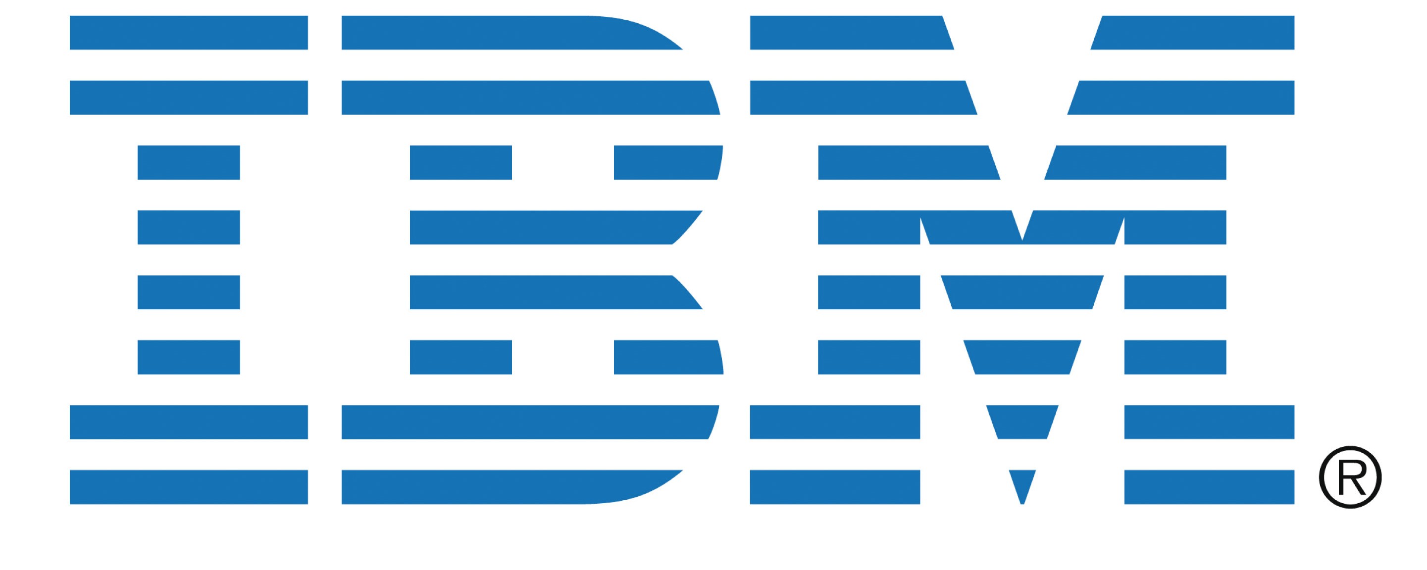
Navy pattern at first glance, the logo of the American giant is nothing more than blue letters pierced by white lines. But if you look closely, they are hiding in the corners equations, bringing the idea of IBM into the world equality or equality.
10. Unilever
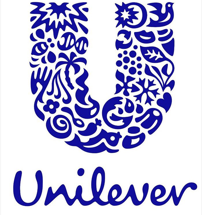
Unilever is one of those brands that is omnipresent but nobody really knows what it is. Unilever itself does not have as many original products as it has brands under its umbrella that we all know well and we use it every day. A set of all these is represented by symbols in the logo.
11. BMW
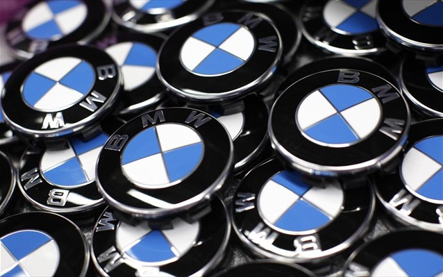
Many people believe that the BMW logo is expensive blue sky and rotating aircraft propeller, so that it comes from the times when this German giant was already operating in aviation. But the company has been around for years 1917 (and with it the emblem), while they started dealing with aviation "only" years ago 1929. The blue and white quadrants actually symbolize that the colors of the Free Land of Bavaria. The reason for the confusion lies in the fact that national symbols were not allowed to be used in commercial purposes, so they were used in reverse order. Otherwise, even this logo was not created from scratch, as it brought the basics from the company's sign Rapp Motoren Werk, the predecessor of BMW.
12. Coca-Cola
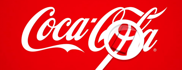
Take a closer look at the others "About". Notice what? No? No reason, most don't. Well, that's where he's hiding Danish flag, which was not the original intention. Upon discovering this, Coca-Cola exploited it commercially. Denmark was considered to be the happiest country in the world and at their largest airport, the company welcomed people with flags.
13. Audi
Four rings they are more than just four rings. Audi, which in Latin means exclamation "hey", with four circles, it shows honor to its "founding fathers", to four vehicle manufacturers (Audi, DKW, Horch and Wanderer) that raised him.
14. FedEx

The FedEx logo is one more creative ones. At first, you may not see anything more than the inscription in two colors, but soon ("in the negative") it will also be drawn an arrow, which is actually just a space between letters "E" and "x". With it, the company symbolizes its advanced thinking and outlook, or orientation to future.
15. Adidas
Did the Adidas logo ever remind you of mountain? If so, then you have debunked it. Years 1967, when it was created "flowering" logo, it had no deeper meaning. In the 1990s, when the diagonal lines were created, a message was also wrapped in it, and today the lines symbolize the mountain, which further symbolizes obstacles which people have to deal with on a daily basis.
Adapted and adapted from:
diply.com

