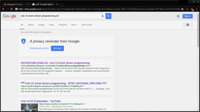
The Google web search engine has a new look. This has been predicted for quite some time, ever since Google started using a new design language, Material Design, which replaced the Holo design language. So far, only a draft of the new Google search engine is out there, which is already being tested by users in the US, and could be available to all users as early as the fall of 2016.
The Google web search engine has a new look. It's the biggest change in recent years, when the search engine only underwent cosmetic fixes and stuck to its old image as a plot drunk. With a new design language Material Design but the changes are obvious even to the less conscientious eye.
READ MORE: Find out what Google knows about you!

In addition to the graphic image, the way the results are displayed is also changing. Instead of a series of hyperlinks in blue, each result now has its own white "card", and the white background of the search engine was colored grey (in the colors of the personal assistant Google Now), while the settings icon changed from lines to dots. The biggest change is probably relocation of advertising and informational content, which we have been used to until now on the right side or over organic results, but now it's shifting among the search results. The changes aren't tectonic, but given that the look and feel of the Google search engine has been virtually unchanged since its inception, it's more than welcome image refresh, which will also simplify online search.


