


Did you know that our picture of the world is distorted? After seeing these photos, you will never look at the world the same again! The reason why some countries on the map are larger or smaller than others, even though they are not, is the antediluvian transverse Mercator projection or. a cylindrical map projection in which meridians and parallels are straight lines that intersect at right angles, and which allowed mariners to plot their course as straight lines. The result of transferring the surface of the Earth to paper is today's misconception of the size of some parts of the world. The projection of the three-dimensional world on paper has its price, and we pay it with a distorted picture of the world even today, even though the maritime industry no longer uses classic maps for navigation. That is why such cards are still hanging in schools and, among other things, falsely create the impression that Russia and the USA are so big.
"Guilty" for ours a distorted picture of the world it is cylindrical cartographic projection, which was invented by a Flemish geographer and cartographer Gerardus Mercator, who is considered the originator of modern scientific cartography. This one is in 1569 invented a way to put the earth's surface on paper, i.e. from a three-dimensional to a two-dimensional form, but as a result many anomalies reflected in the size of the territory, as a result of which our present-day idea of the size of certain parts of the world is completely distorted. As a result of the transverse Mercator projection, the size of countries/continents changes significantly in relation to their own distance from the equator (its projection neglects the relative size of individual parts of the surface, both land and sea).
READ MORE: Geography is a little different

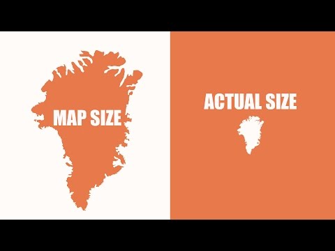
Not only Mercator, but also many others cartographers were faced with the same dilemma - to give priority to the right shape of the territory or the right size ratio. Most recognized size distortion as the lesser evil, and the maps we know they increase the area of Europe and North America the most, and they reduce Africa and South America the most. Antarctica and Greenland are also much larger on the map than they actually are. To see how much of a delusion we're living in, take a look at the following series of maps created by thetruesize.com and which display individual countries in real size. You knew it was Europe is only a third the size of Africa and not for two? Funny, the Mercator projection increases the wealthiest countries the most, but decreases the former colonies (i.e the third world). Coincidence?
A distorted view of the world: after seeing these maps, you will never look at the world the same again!


How can we still trust maps?
More information:
thetruesize.com

