


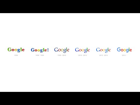
Six simple colorful letters on a blank page. This is Google. One, if not the most powerful brand in the world and a name that has become an independent verb in the dictionary. They recently changed the look of their recognizable logo, but while tectonic shifts are taking place in the background with the restructuring of the company, where the parent company was renamed Alphabet, Google remains faithful to its previous appearance. The web giant left the colors of the letters as they are, but used a new typography where the letters are softer. On the other hand, the icon experienced a more visible change.
Google has a new logo after 17 years and this one is completely different, although it remains fundamentally simple. The technological giant did not interfere with the colors, but that's why they made it new typography, which has gentler shapes, and there are supposed to be new letters easier to read on smaller screens. The technological landscape has changed drastically since the last change in 1999, and that is Google's a response to the challenges of the times and the evolution of the company.


The logo was presented right on the home page through an animation where the old one is erased and a new one is drawn, followed by new icon and four colored dots (these will be active during voice search). It is the icon that passed through the biggest stylistic transformation. Namely, the anemic small printed 'g' was replaced by a large printed 'G', which was dressed in characteristic colors. And if the changes to the logo are not as drastic as the recent restructuring where it was Google "relegated" to a subsidiary company of the new umbrella by Alphabet, and the letters are in the manner of red letters of a newly formed company. In addition to the animation, Google also provided a short video that takes us through 17-year history of changing the Google logo, which today is no longer static than it was recently.

More information:
google.com

