


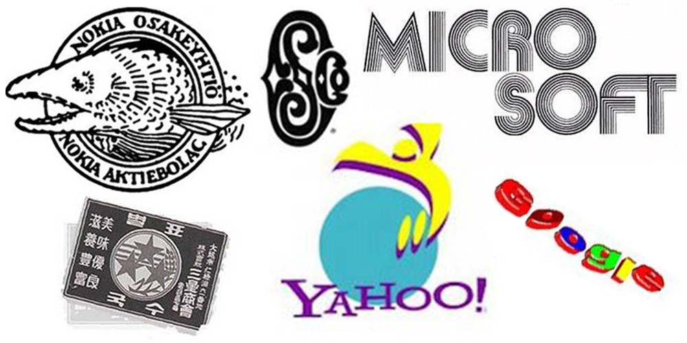
The evolution of the logo is a reflection of the development of the brand or the story of the company over time. If anyone, it is the technology companies that have to adapt, prove and respond to the challenges of the times day by day. In the world of technology, what was new yesterday is already old today. This can also be seen in the logos, and some giants have gone through really drastic and not just cosmetic changes. Check out how Apple, Microsoft and other tech giants responded to the challenges of the time.
While some tech giants have not changed their logo, which embodies the spirit and future endeavors of the company, for decades, others have traded like shirts. The pace of change in technology is killing and only with changes (also visual images) brands remain relevant. Of course, there are bright exceptions.

READ MORE: Penised.com - Phallic Logo Makeover
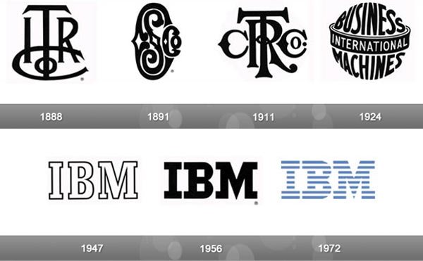
For example IBM is considered one of the most recognizable brands in general, even though it hasn't changed its sign since a long time ago in 1972. On the other hand, he went Hewlett Packard (HP) to numerous "surgical" procedures since its inception in 1939 and in this way maintained a "fresh" appearance. Things "calmed down" only when only the initials remained in the logo.
What about the rest? Believe it or not, even some of the tech giants have changed their logos so much in their relatively short history that their original logos you wouldn't even recognize it. Are you going to bet?