


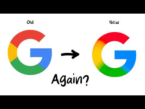
New Google Logo 2025! Google has refreshed its iconic "G" logo after a decade, replacing the hard blocks of color with a soft gradient. The change is subtle, but it symbolizes a larger shift toward modern, AI-focused design.
After ten years of unchanged appearance, Google On May 12, 2025, it quietly unveiled a redesigned “G” logo. The new logo Google 2025! Instead of four stark blocks of color—blue, red, yellow, and green—the colors now smoothly blend into each other, creating a fluid, modern gradient. The shape of the letter remains the same, but this subtle change reflects Google’s shift toward a more sophisticated and technologically advanced visual language.
New Google Logo 2025 Why Now? Why the Gradient?
At a time when Google is increasingly focusing on artificial intelligence, the new logo aesthetic aligns with the design of their AI assistant Gemini, which also uses gradient colors. This change is not just aesthetic; it symbolizes Google's transition to an era where AI plays a central role in their services and identity.
Where can you see the new “G”?
Currently, the redesigned logo — the new Google 2025 logo — is visible in the Google Search app on iOS and Pixel devices. Android users will see the change with app version 16.18 (beta). On the web and in other Google apps like Gmail, Maps, and Chrome, the old logo remains, but the new aesthetic is expected to be gradually introduced there as well.

Subtle change, big meaning
Although the change is almost imperceptible at first glance, the new Google 2025 logo, especially at smaller icon sizes, represents a significant step in Google's design evolution. The transition to gradient colors symbolizes openness to change and adaptation to modern design trends, while maintaining brand recognition.
What's next? New Google logo 2025
While Google has not yet officially announced changes to its other logos, such as those for Gmail, Drive, or Maps, it would be logical to expect them to follow the new design language as well. This would create a more unified and modern visual identity for Google that reflects their focus on innovation and technology.
Conclusion: good – bad – what do you think?!
Google's new gradient "G" logo is more than just an aesthetic update; it's a symbol of a company evolving and adapting to modern trends and technologies. Although the change is subtle, it reflects Google's approach to innovation and their commitment to advancing in the age of artificial intelligence.

